Atlas Visual Language
Warm Geometric Symbolism, the brand system we built for the studio itself, and the lens we use to design every Atlas asset.

A studio that ships products needs a visual language that travels. The brand mark needs to read on a sticker and on a billboard. The product UI needs to feel like the print piece. The slide deck needs to feel like the website. Most studios solve this with a colour token file and a tight grid. We wanted more.
Warm Geometric Symbolism is the visual system we built for Atlas Interactive itself. It is the system we apply when we design for clients too. This page is what it looks like, distilled.
Five principles
The system rests on five rules, in this order.
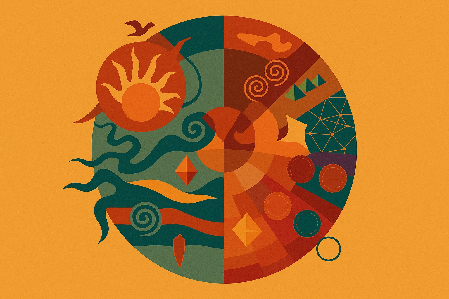
- Geometry first. Compositions begin with primitive forms - circles, arches, mountains, layered waves. The geometry must feel balanced, intentional, and modular, never decorative.
- Organic counterbalance. Hard geometry is always softened by organic rhythm - flowing waves, curved terrain, spiral solar motifs, asymmetric leaf forms. Structure and nature in conversation.
- Symbolic reduction. We do not illustrate literally. Mountains become layered curves. Growth becomes leaves. Innovation becomes faceted crystal geometry. Energy becomes a sun. Motion becomes flowing bands.
- Modular system thinking. Every asset is part of a larger system. Elements repeat, align to hidden grids, reuse motifs, share proportional logic.
- Atmospheric warmth. Atlas visuals are never cold. Sunlit, tactile, earthy. Closer to matte printmaking than to digital rendering.
The palette
Earth tones, oxidised minerals, sunset light, aged pigments.
| Colour | Hex | Where it lives |
|---|---|---|
| Warm Ochre | #E6A24A | Dominant atmosphere, backgrounds |
| Deep Teal | #1F4E4A | Structural foundations, typography |
| Burnt Orange | #C65A2E | Active accents, energy |
| Terracotta Red | #A63D2F | Emotional warmth, emphasis |
| Soft Sand | #F2D6A2 | Highlight surfaces, contrast |
Distribution rule: 60-70 percent Warm Ochre dominance, 20-25 percent Deep Teal family, 10-15 percent accents. No pure black or pure white. No gradients. No cold synthetic blues.
Typography
Playfair Display for editorial headlines, intellectual and timeless. Inter for product UI and body, modern and legible. DM Serif Display for symbolic moments - oversized initials, monograms, hero compositions.
Motion
When the system moves, it moves slowly, fluidly, ceremonially. Reference qualities: flowing water, drifting sunlight, waving fabric, atmospheric particles. We do not glitch and we do not snap. The hero on this site is the motion principle made concrete - a slow-rotating sun, drifting wave bands, particles rising at varied paces.
Governance, distilled
Always: geometric symbolism, warm atmospheric balance, modular consistency, negative space, tactile matte finishes.
Never: gradients, neon, gloss, overcomplicated illustrations, visual chaos, cold corporate minimalism, thin outline iconography.
The full brand system lives as an internal document. The version you see across this site, across Oji, and across our client work is the same system applied at different scales.
Structured worlds with human warmth. That is what the language is for.