Why Warm Geo
The visual language behind Atlas, what we mean by "structured worlds with human warmth," and why we ruled out the obvious alternatives.
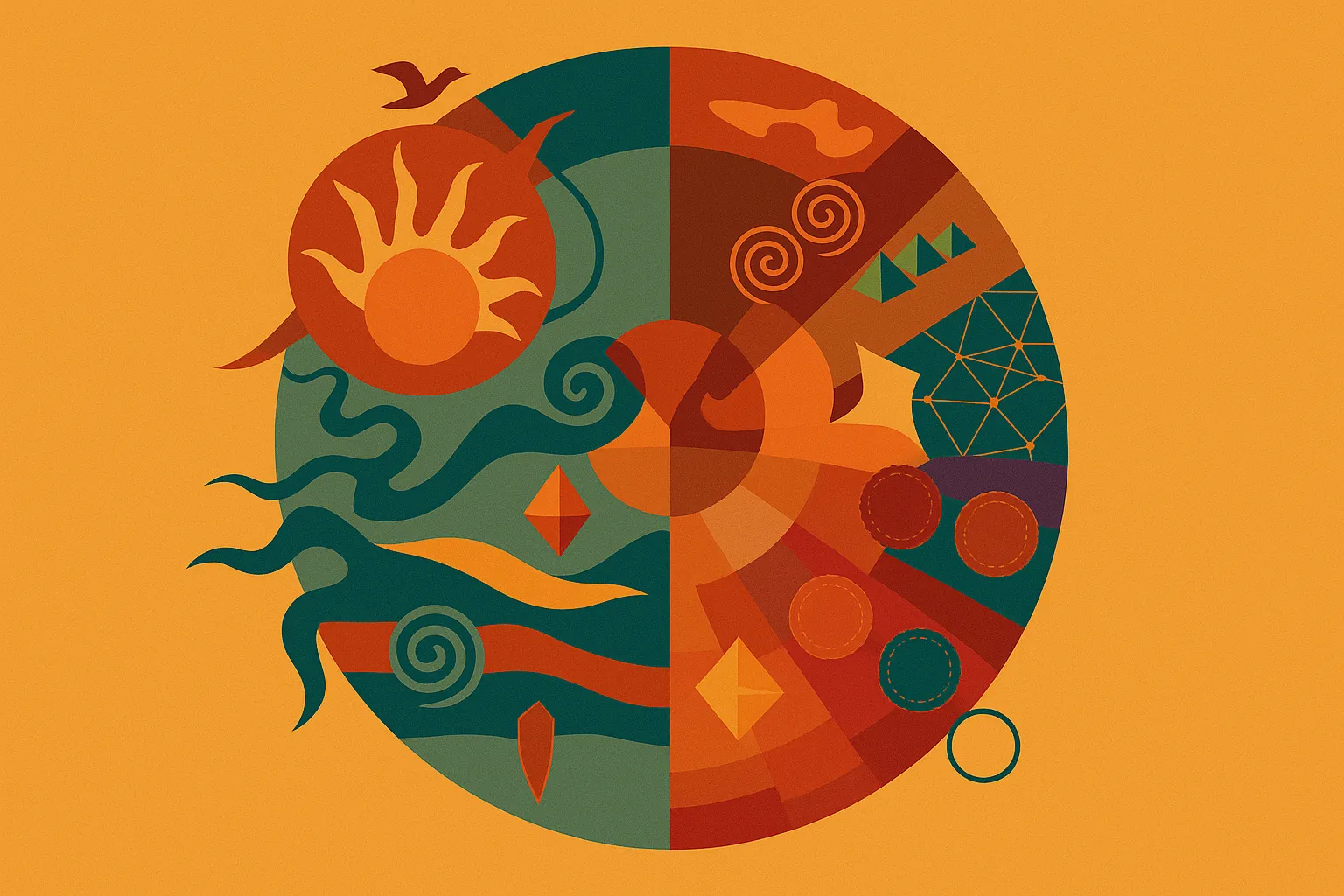
We named the Atlas visual system Warm Geometric Symbolism - Warm Geo for short. Both halves of that name are doing work.
Geometric, because we’re building systems
A studio that ships products needs a visual language that survives translation across surfaces - a brand mark, a product UI, a slide deck, a print piece. Geometric primitives (circles, arches, mountains, waves) are translatable. Hand-drawn illustration isn’t, at least not without a single illustrator carrying it everywhere.
The geometry also signals what we are. Atlas Interactive builds intentional systems. The visual language should look like the work behind it.
Warm, because cold geometry is everywhere
The default for systematic design is sterile. Helvetica, white background, faded blue accent, “made for serious work.” We made the opposite call: warm earth-tones (ochre, terracotta, soft sand), tactile grain over flat fields, Playfair Display for headlines. Read the brand essence in any moment of fatigue: structured worlds with human warmth.
Most software wants you to ignore it. Atlas products want you to notice them - like a well-made object you touch every day. The visual language is part of how we earn that.
What we ruled out
- Pure flat / Bauhaus-modern: too cold. Atlas isn’t a Swiss watch.
- Brutalist / raw-HTML: too ironic. Atlas isn’t a wink at someone else’s seriousness.
- Memphis revival / playful pop: too aimless. Atlas isn’t decoration.
Warm Geo is the result of subtracting those defaults until what’s left is just: geometry that holds, warmth that softens, restraint that calms. Then we built the rest of the studio around it. The full system lives on the Atlas Visual Language project page.
Kaje